Monday, 29 November 2010

Influential Artists

http://showstudio.com/contributors/335
This is a website that has some images and artwork on a Graphic Designer named Peter Saville. I really like Saville's work as he has a wide range of talents and his work always varies, sometimes it feels illustrative and has a traditional feel and on other occasions his works are very digital. His work is inspiring and nice to view.


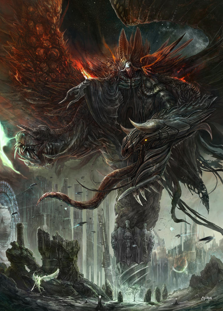
This is an artist named Ertac Altinoz
His Graphic Illustrations are amazing.
His works tend to be based on Fantasy Art as he loves designing his own mythical beasts and monsters.

Tattoo Illustration

http://graffititools.blogspot.com/2010/08/discover-tattoo-illustration-techniques.html
this is a site that i found to do with tattoo illustration.I have used this as reference to make my own and hopefully i will later be able to post one of my own worked up digital tattoo.

Monday, 22 November 2010

My Photography!:)

 These are some photos i took on a trip to the V&A museum in London. I liked a few of the shots i took but really i think it was the good artwork that did my photos justice.
 I like this shot because the sculpture vaguely resembles Stephen Fry.
 This is a bit of a bad angle shot and a little out of focus but nice piece of work.
The white shadow in this shot is great I really like this shot.XD

preparing images for web

On your desktop you should make a new folder and copy any work that is an illustrator,photoshop or an InDesign file into that folder you then want to select your desired pieces to ready for web by opening them up.

For Photoshop you must go to Image Size which is under Image then make sure your resolution is set to 72 dpi. then resize your image to your needs by changing the width and height.

For Illustrator and InDesign you have to Export your Image which is under File.
There you can change Resolution to 72 dpi and adjust the height accordingly.

work


This is the homepage of my website. I have started to add some of my work on there. The work shown was from a magazine project at college where I made a front cover i really liked a couple of my designs so i will be making a slideshow soon of them.

Monday, 8 November 2010

Worked up Homepage

This is a worked up version of my website homepage i prefer the layout of this version. Ist's a lot neater also more personal to my own style.

Official Band Websites


 Above is Children of Bodom's Website being one of my favourite bands I decided to look at their website and use it as reference to making my own website. The first thing you notice about the site I believe is their Custom font for their name,  then the layout and contents of the page.
I dont think I would take the same sort of approach for my own website but this is a good site to refer to for inspiration.


This is Kalmah's official website i really like their custom font also the illustrations really stand out and have a lot of impact on the page.


Escape the Fate's website is okay but it is very plain I do however likethe links panel as it has a nice styalised effect.


The first thing you notice about Devildrivers website is their Name and Font, then their links panel,then they have a slideshow of band photos which is really cool.


I like Machine Heads Website as it is really neatly layed out they have a really catchy logo and an attractive links panel. At the moment they are promoting their new album The Blackening so this has been updated for the purpos of publisising this.

Monday, 1 November 2010

Webpage designs

 This is one of my possible ideas for a home page for my website. It is simplistic and will be easy to navigate.
This will be in the one of the links in the OTHER
Page of my home page showing more of my designs but it is exckusively for the people who like more extreme style designs.

Monday, 11 October 2010

Different styles of photography

 http://www.tonyhowell.co.uk/ - heres is a link to some really nice landscape imagery.
 I like this image as it is really dark and the tree glows. It stands out a lot and the colours are really attractive.

 I like the shadows the stones give off also the darkened edges really make the sun and sky stand out.
 I like the brightness and clearness in this image everything is really crisp and clean.


 I like this image as the colouring is very natural and pure.

Monday, 4 October 2010

Various sites

http://www.blogged.com/blogs/joystiq-117472.html
http://www.blogs.com/topten/10-best-game-blogs/
If you are interested in gaming these blogs may appeal to you.

http://www.guardian.co.uk/news/blog - here is a blog for the most recent news. Its format is more list and there are hyperlinks at the top to navigate to where your interest lies

http://blog.templatemonster.com/2010/03/26/wordpress-video-blog-designs/ - this site will lead you to various different video sites the layout of a lot of these sites are very styalized and nice to view.

Interesting Websites

http://www.pbase.com/w_d_p/sunrise_sunset
http://www.angryblue.com/
http://ertacaltinoz.deviantart.com/ - DeviantArt is good for the slide shows and the vieawable images. For my own website i would go for something more simplistic but its a good site and has amazing artwork and designs.
http://www.bootb.com/en/ - this is a graphic design marketplace with a very illustrative homepage. Its simple design is easy to navigate.
http://www.ngenworks.com/- I like how his website has been presented all the text has a high impact its very bold and does a good job drawing you in.

Monday, 27 September 2010

Setting up Design blog

Hello this is my New Blog
I have successfully registered with UCAS
Here is a link to their website-UCAS

UCAS' purpose is to simplify the application process making applying to college courses and Universities much easier.